

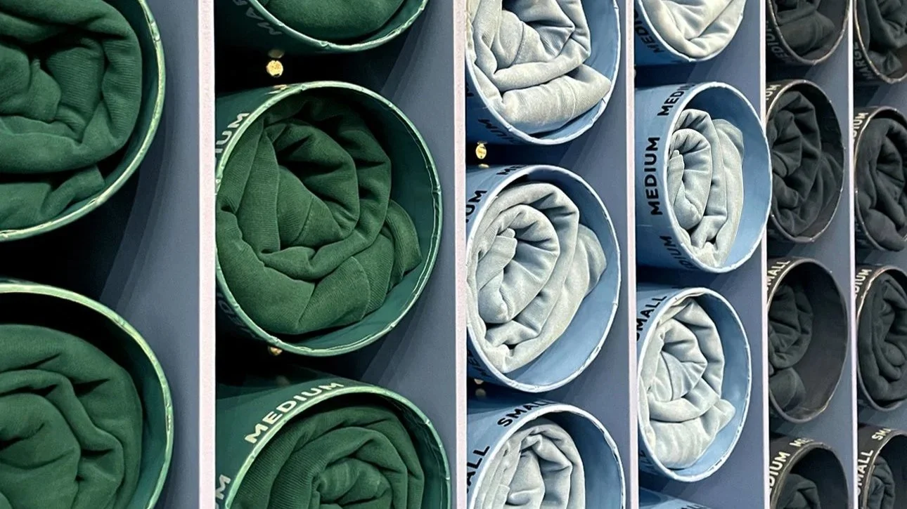
Spaces as soft and cozy as a favourite sweatshirt.
Getting cozy is a state of mind. Like Hygge, but decidedly Californian.
Let’s get heavy. In a short two years, our tiny team:
- Built & renovated upwards of 30 stores
- Defined and redefined the Brand Expression
- Destroyed new store sales targets (often within one day of opening)
- Was featured in WWD
To achieve these consistently upward results, I designed with targeted, systemic efficiency in mind. Well, that and a healthy waft of 1970’s Cali chill. Can you dig it?
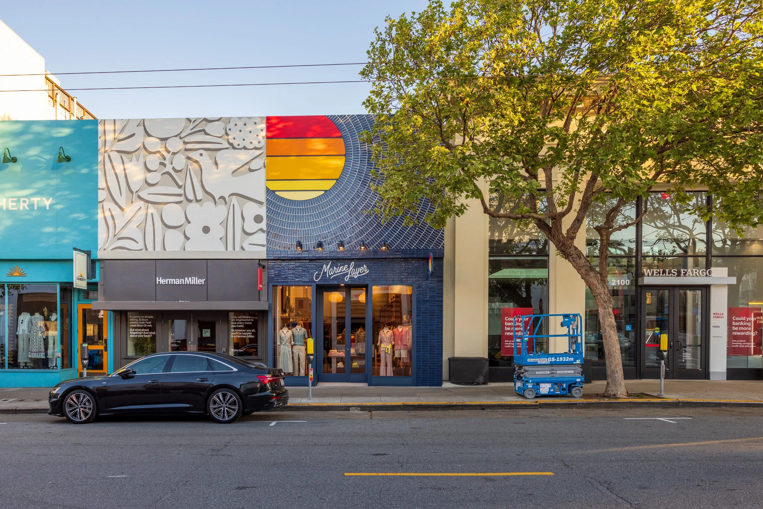
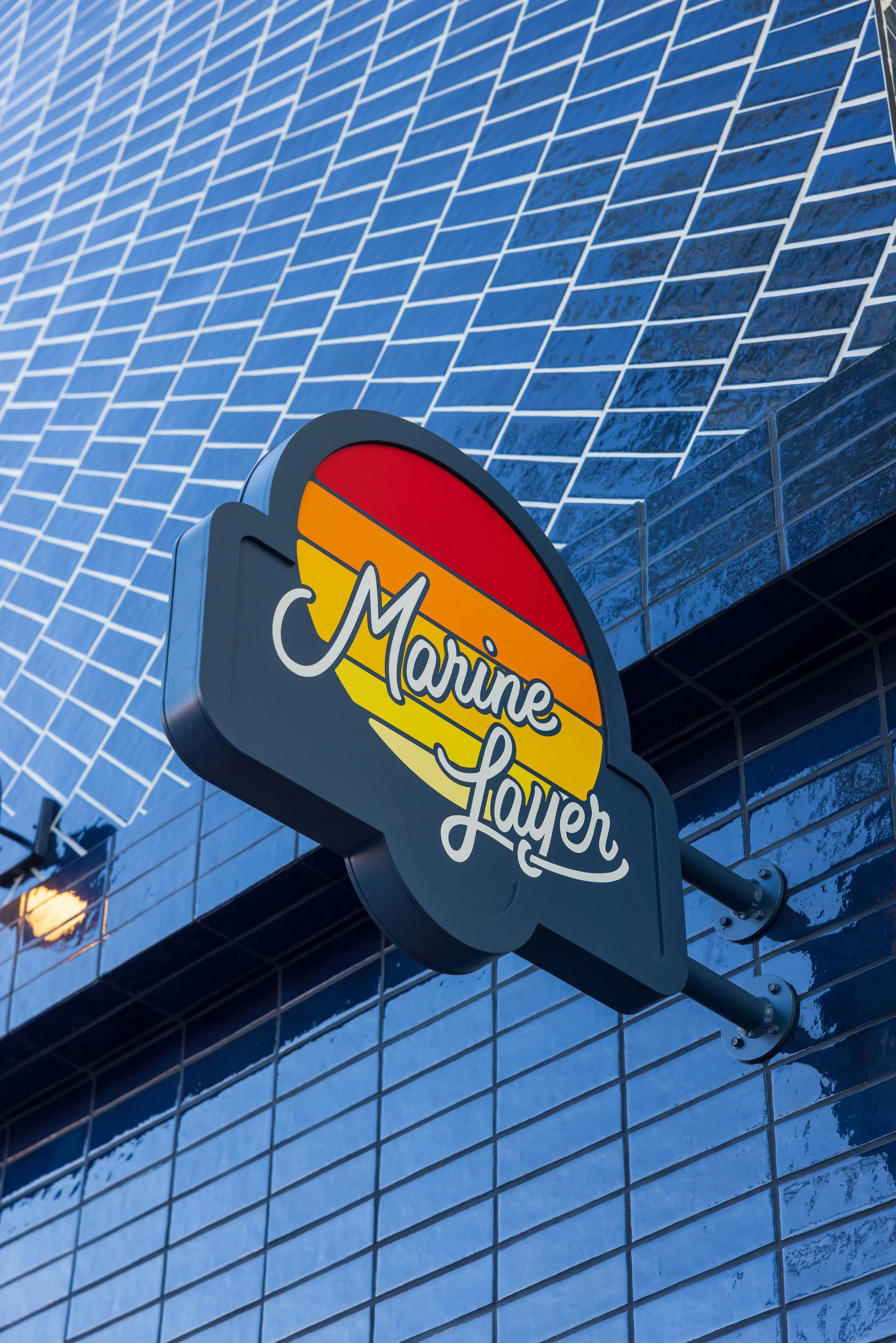
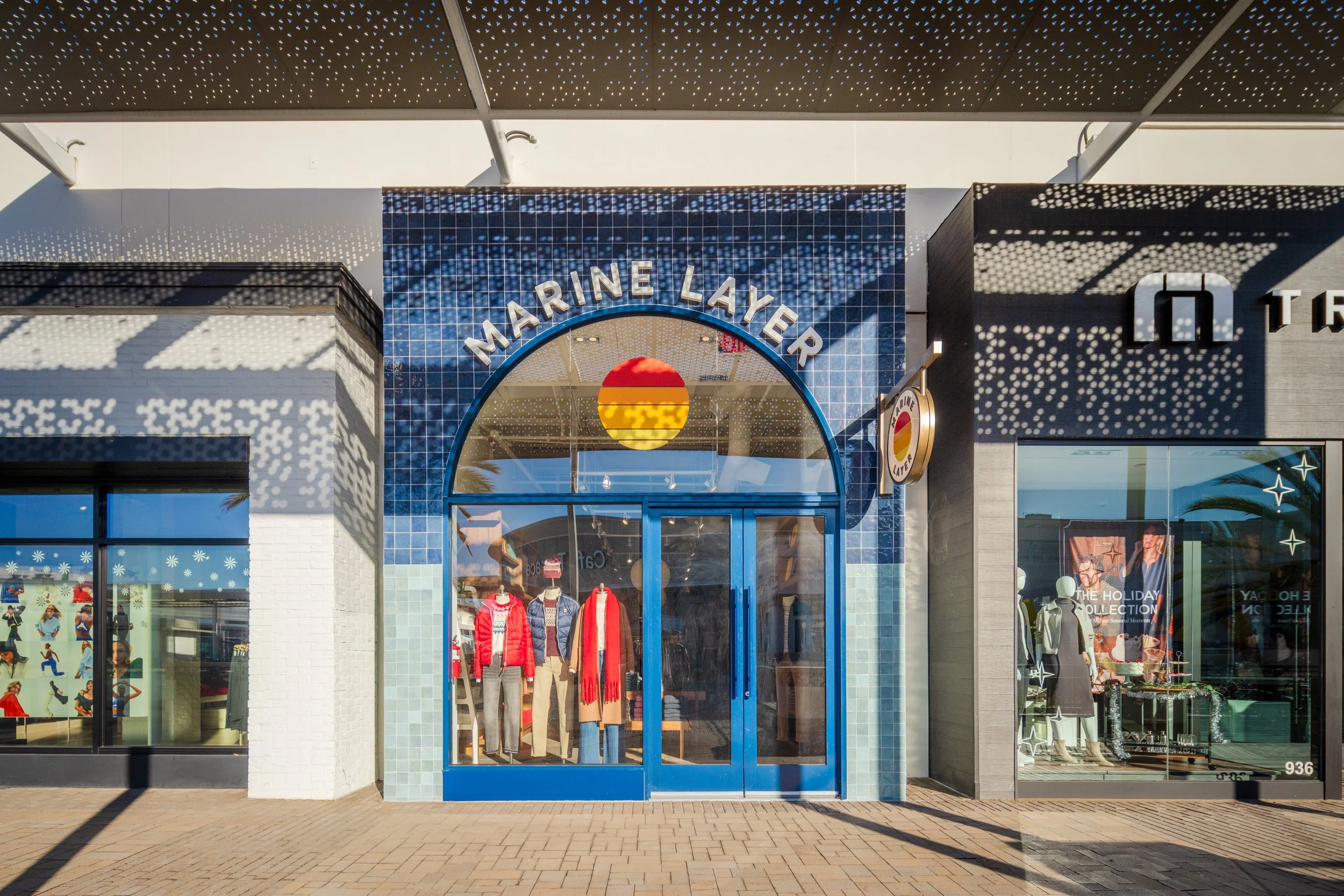
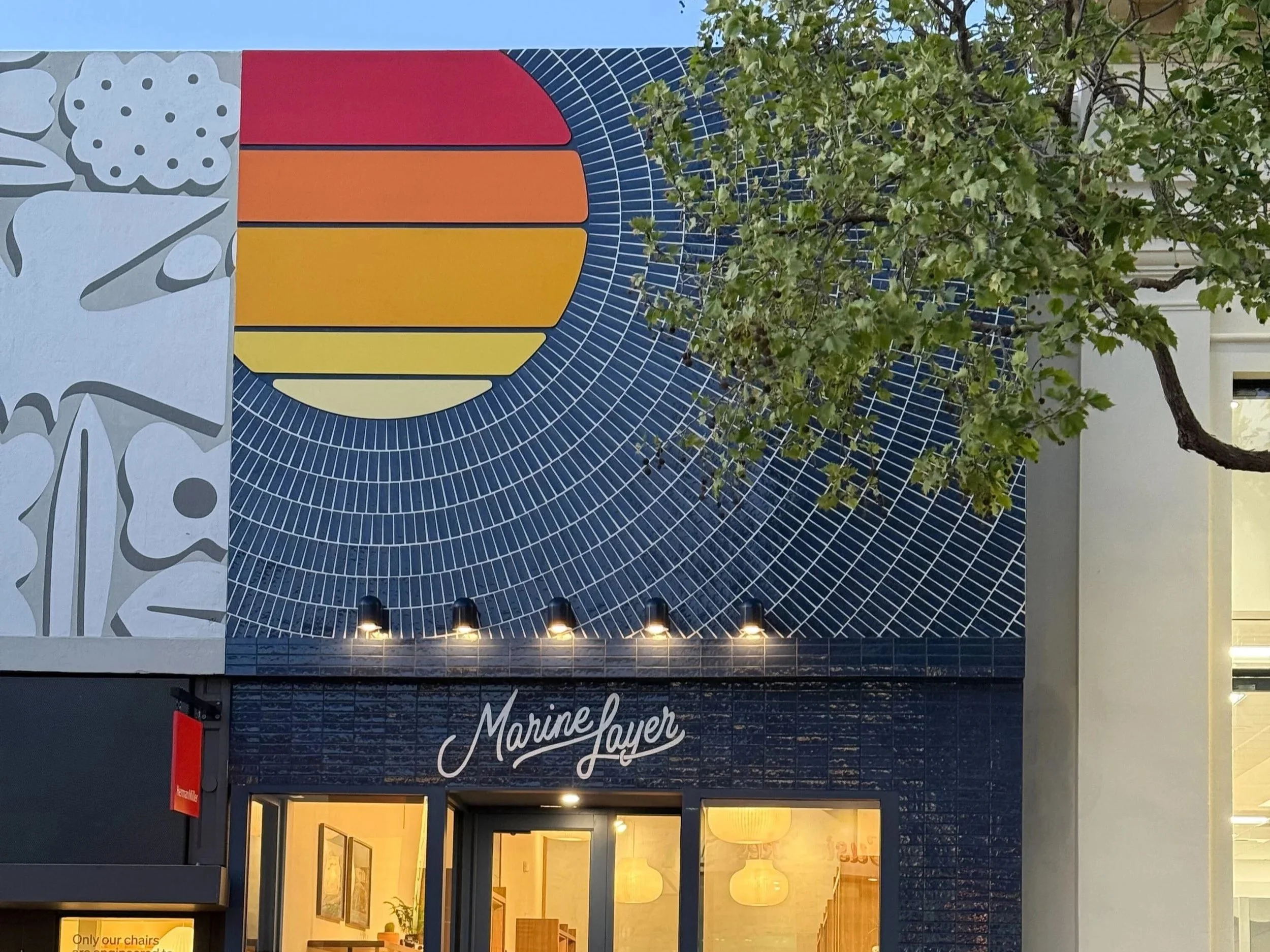
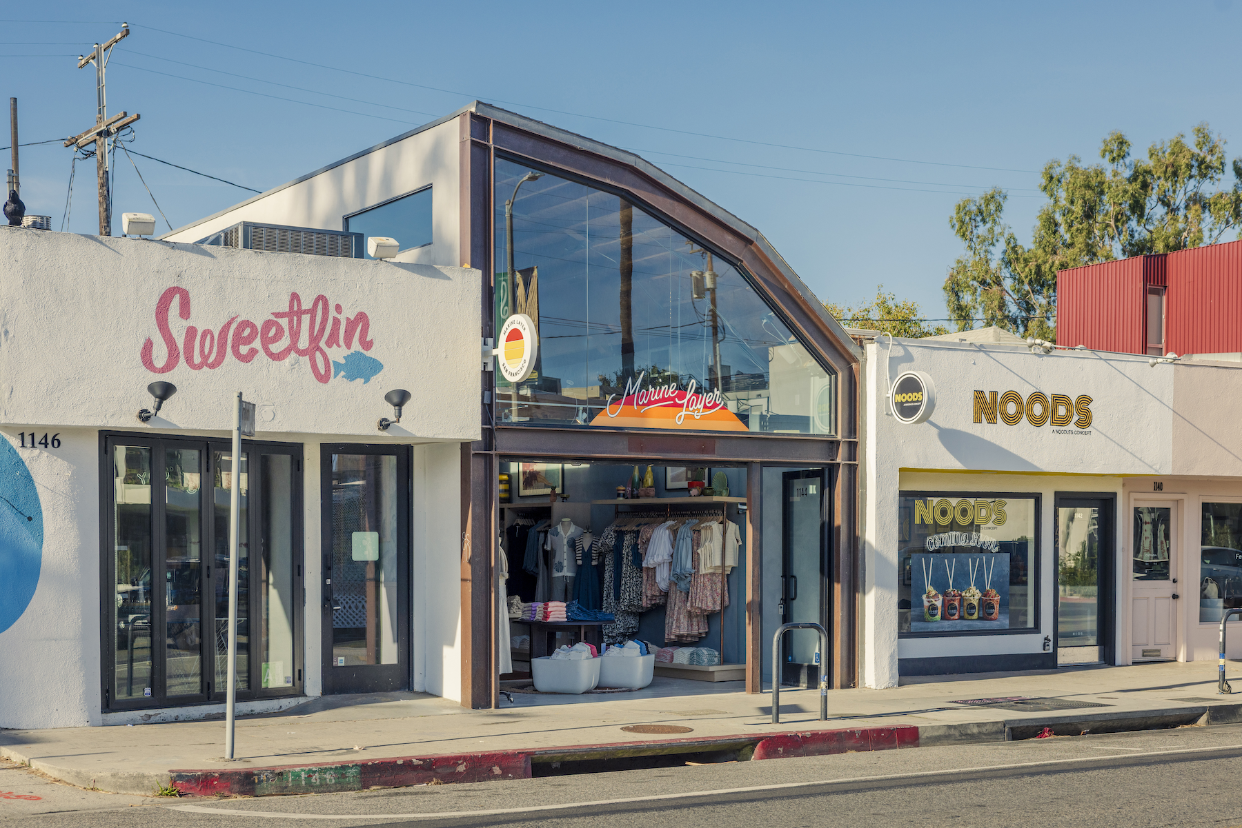
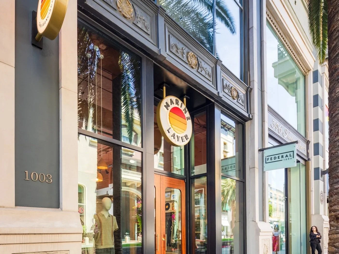
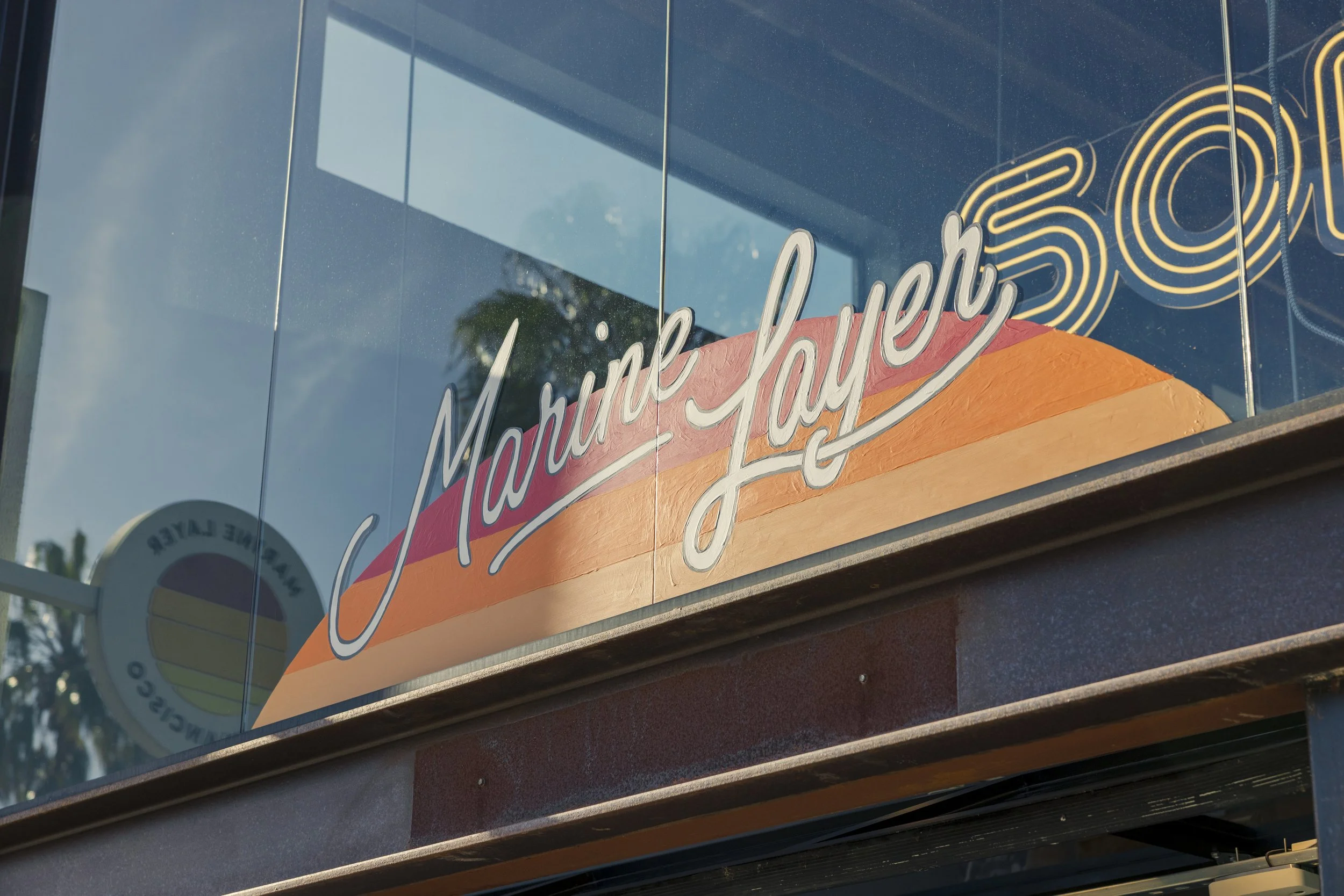
We pushed the Brand (and street level) impact with a massive, custom-fabricated sun, radiating with punchy white-grouted tile.
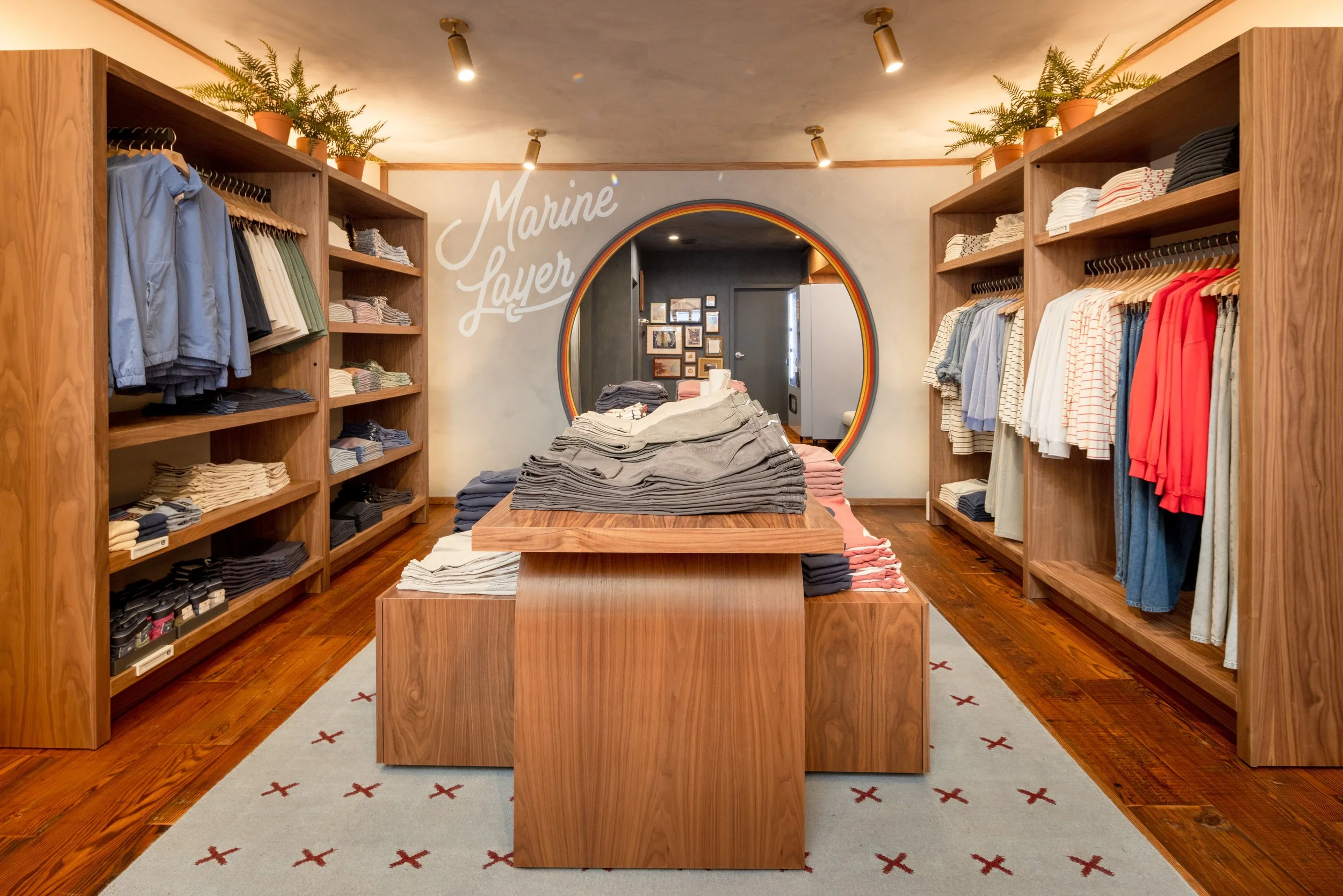
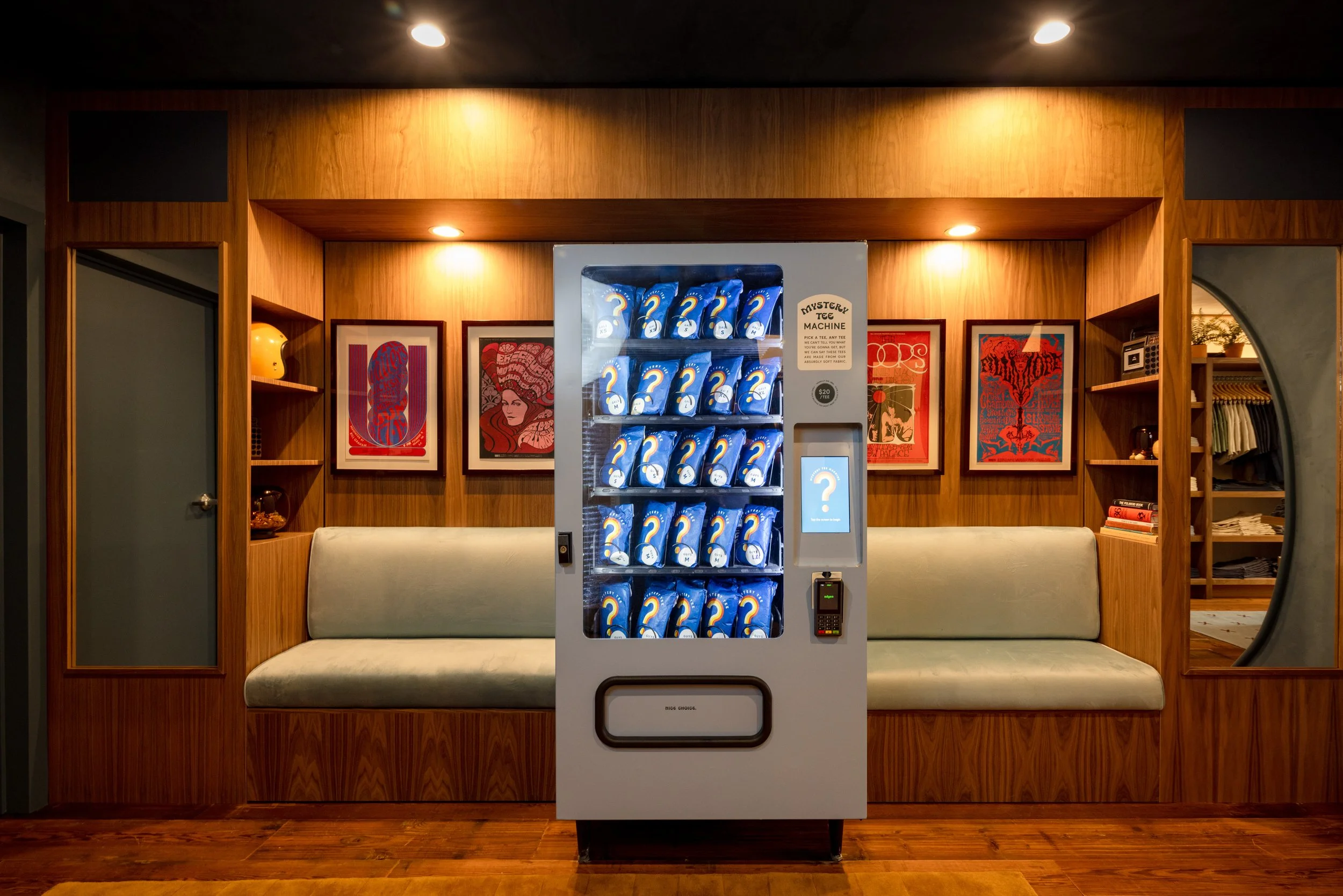
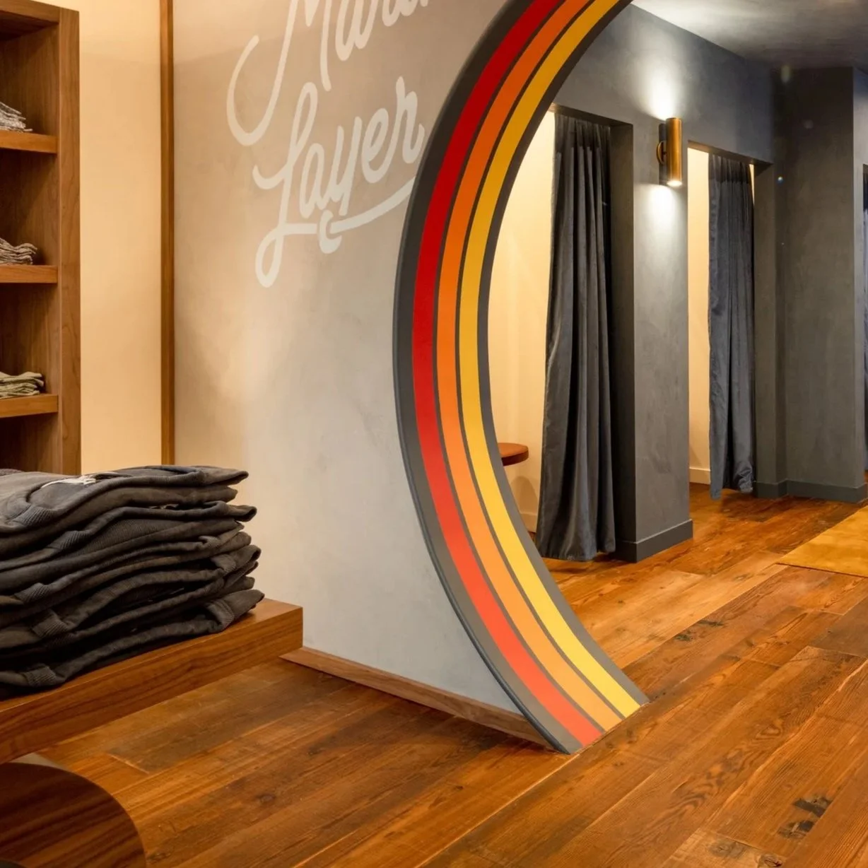
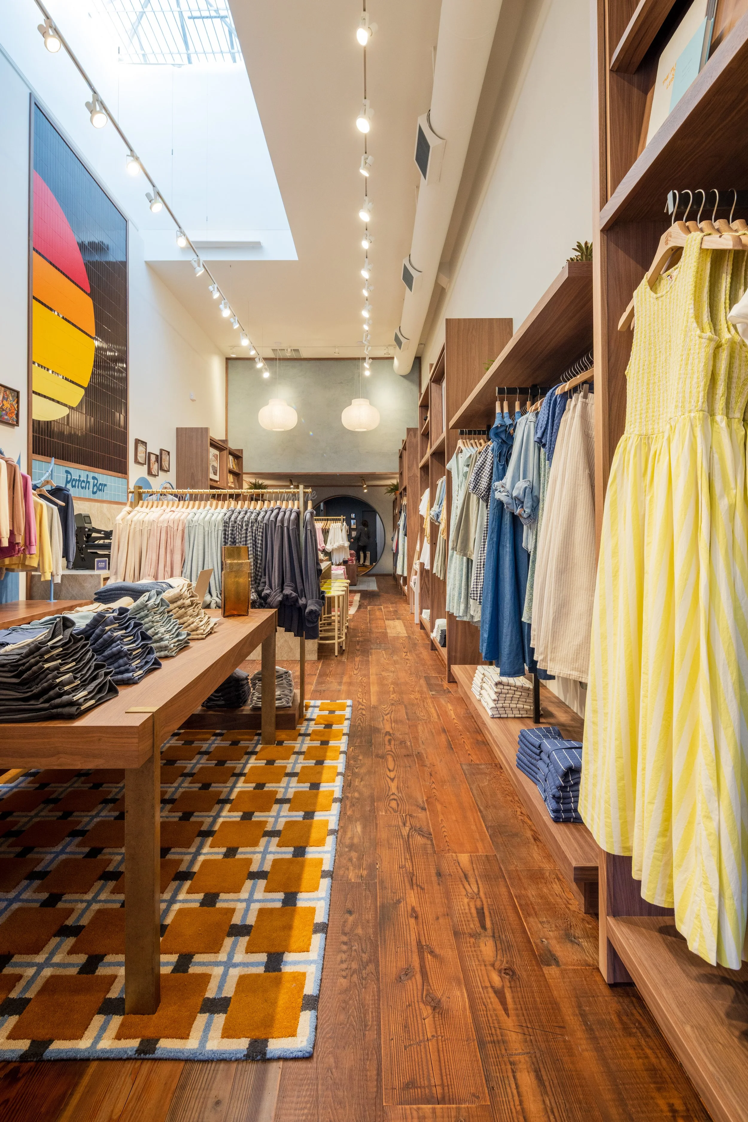
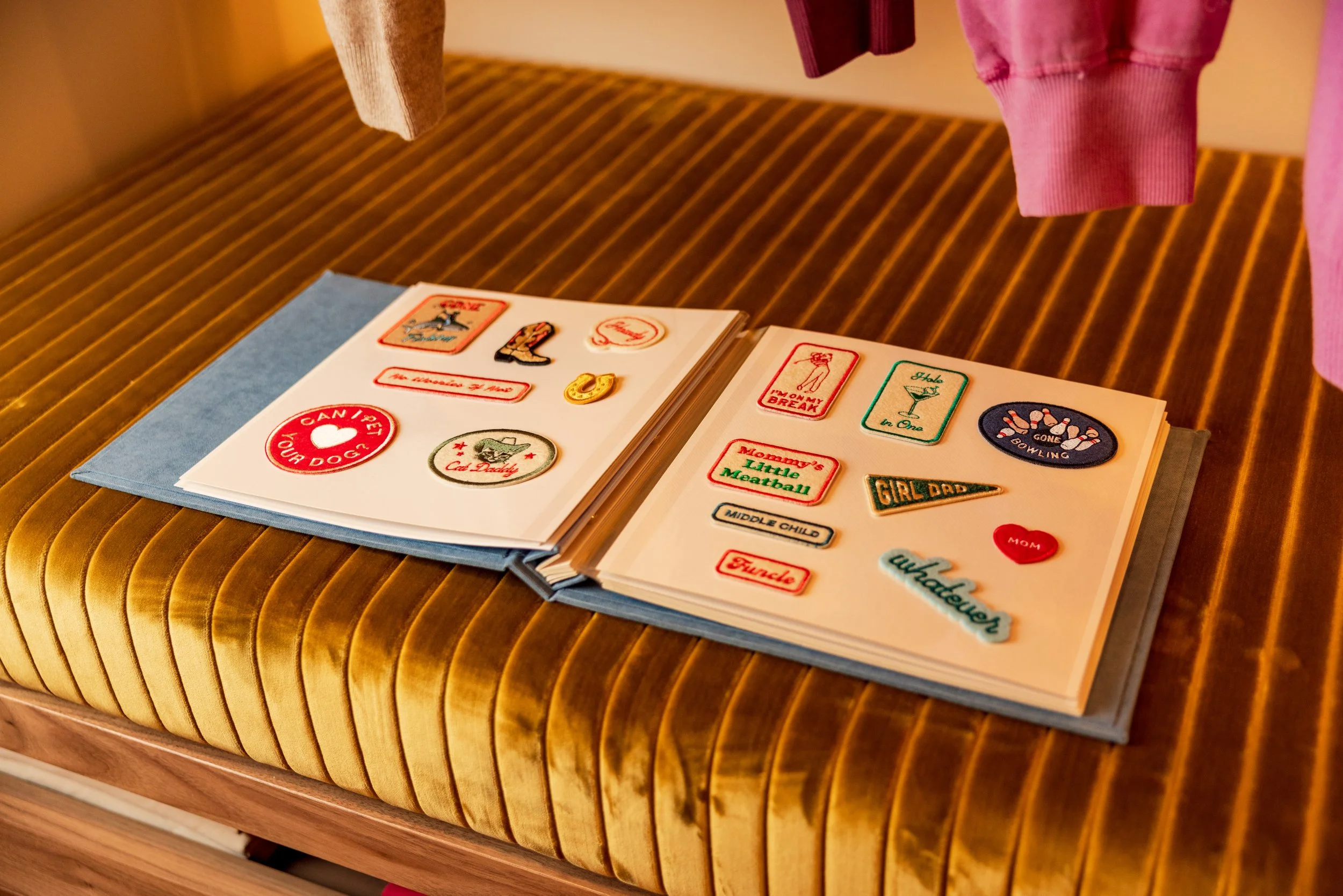
Inside and outside, graphics were hand-painted and oversized, evolving the Brand into an edgier, more playful space.
Colors and design was kept clean and cohesive with little detail of cheeky.
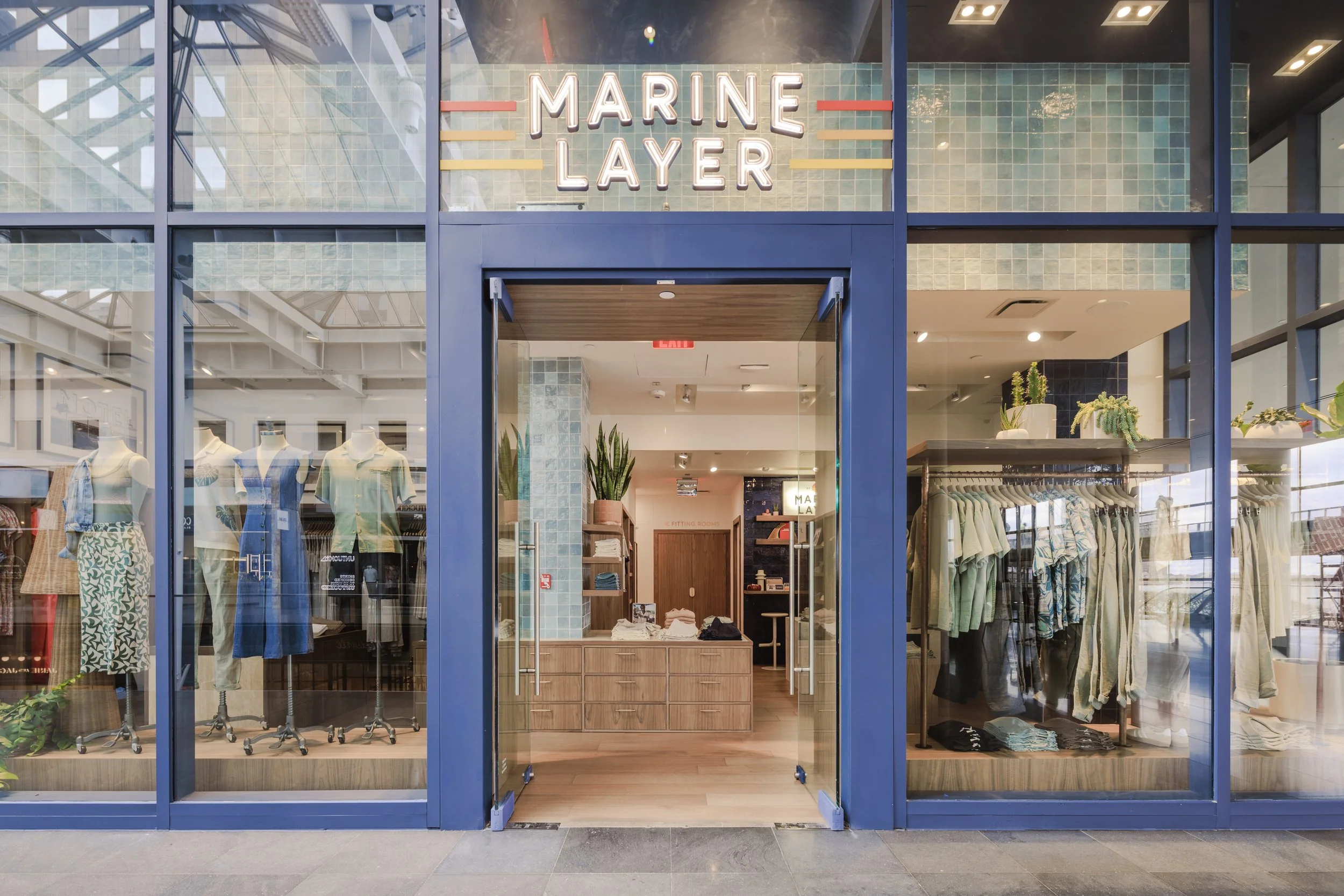
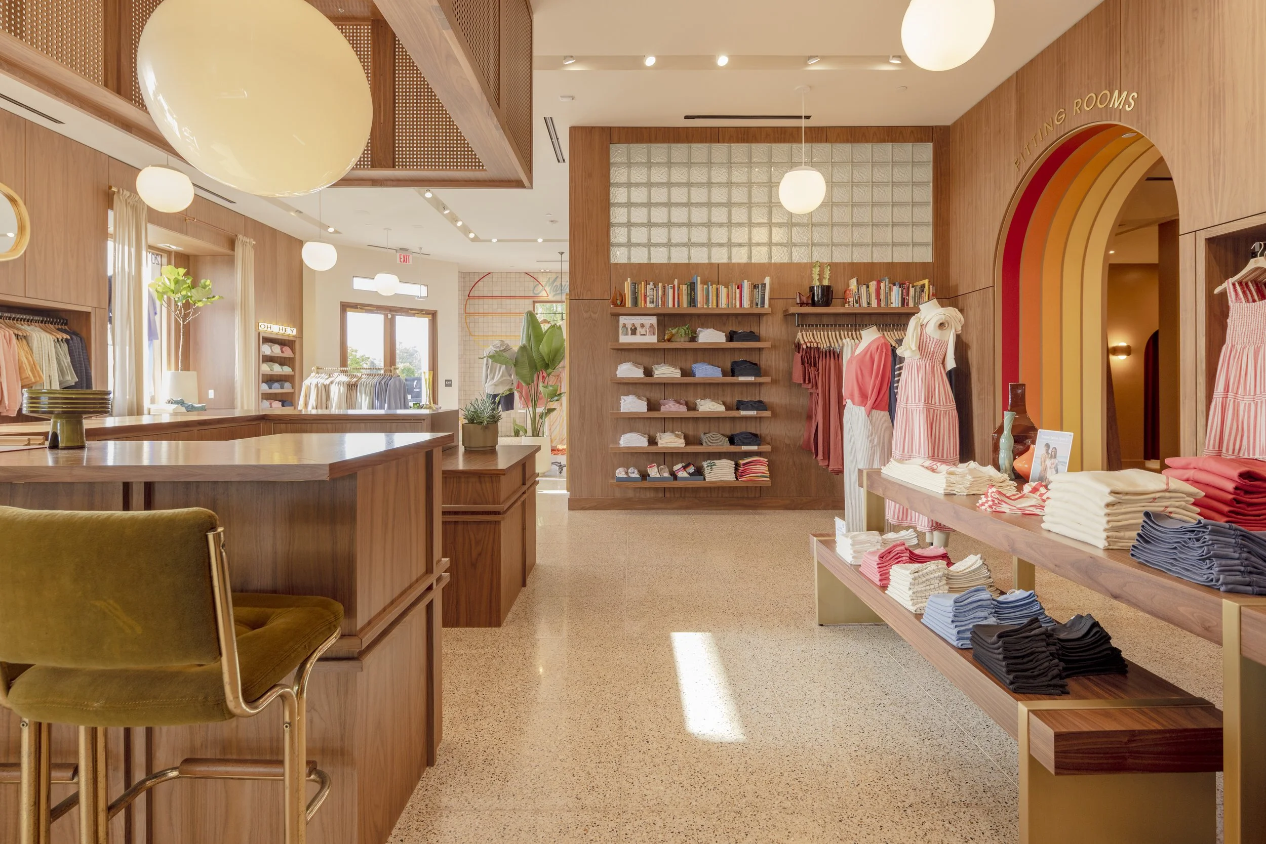
Like this San Francisco store on Chestnut street demonstrates, it’s all in the details.
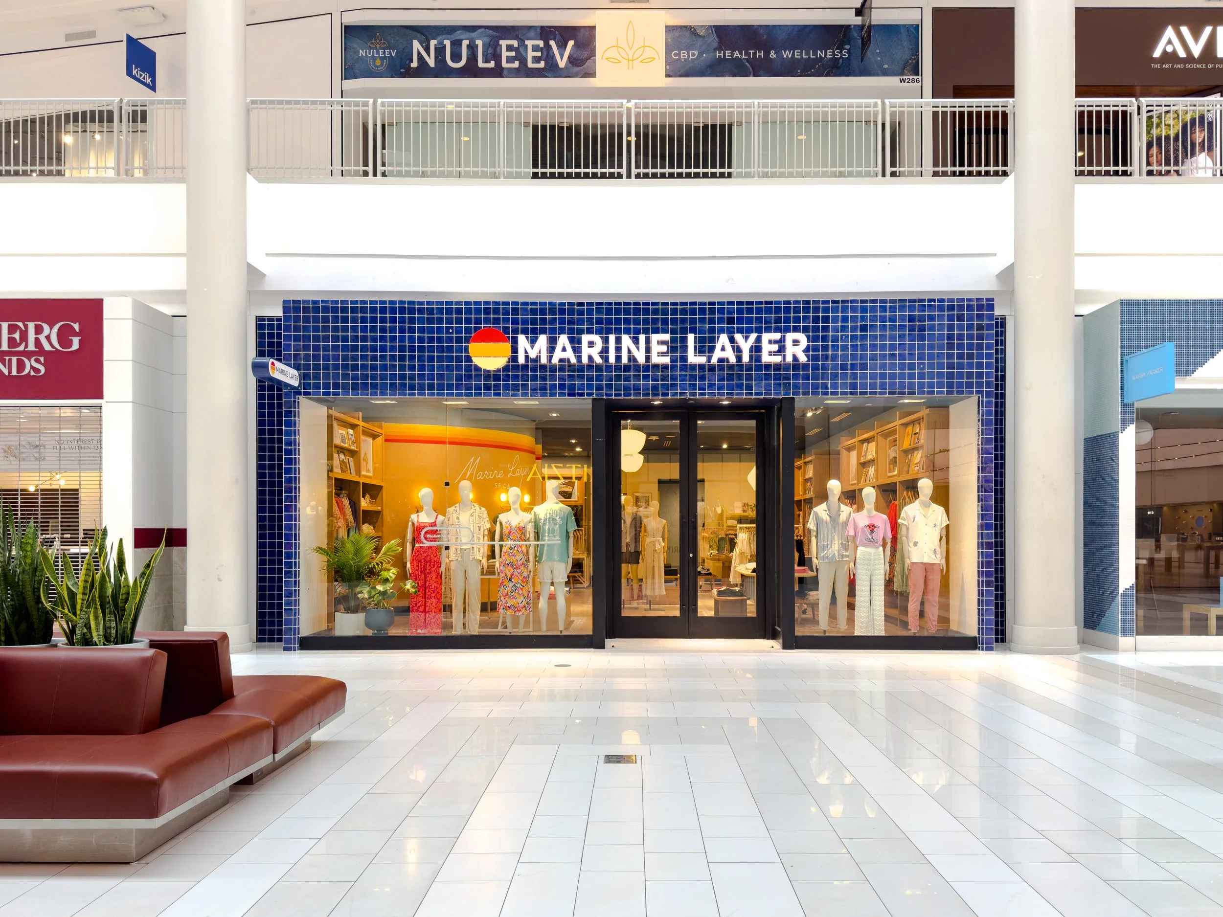
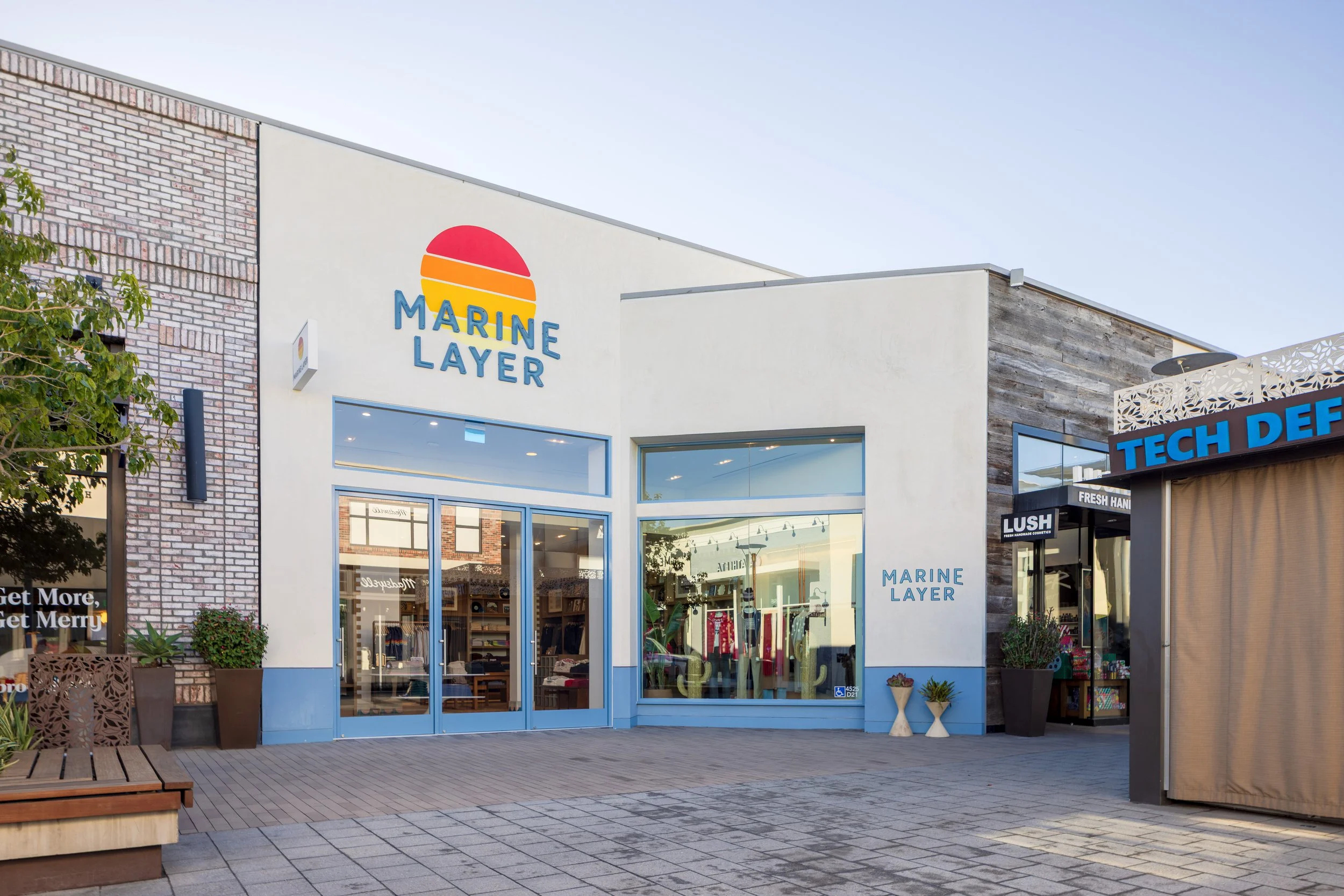
Fresh spaces across the country
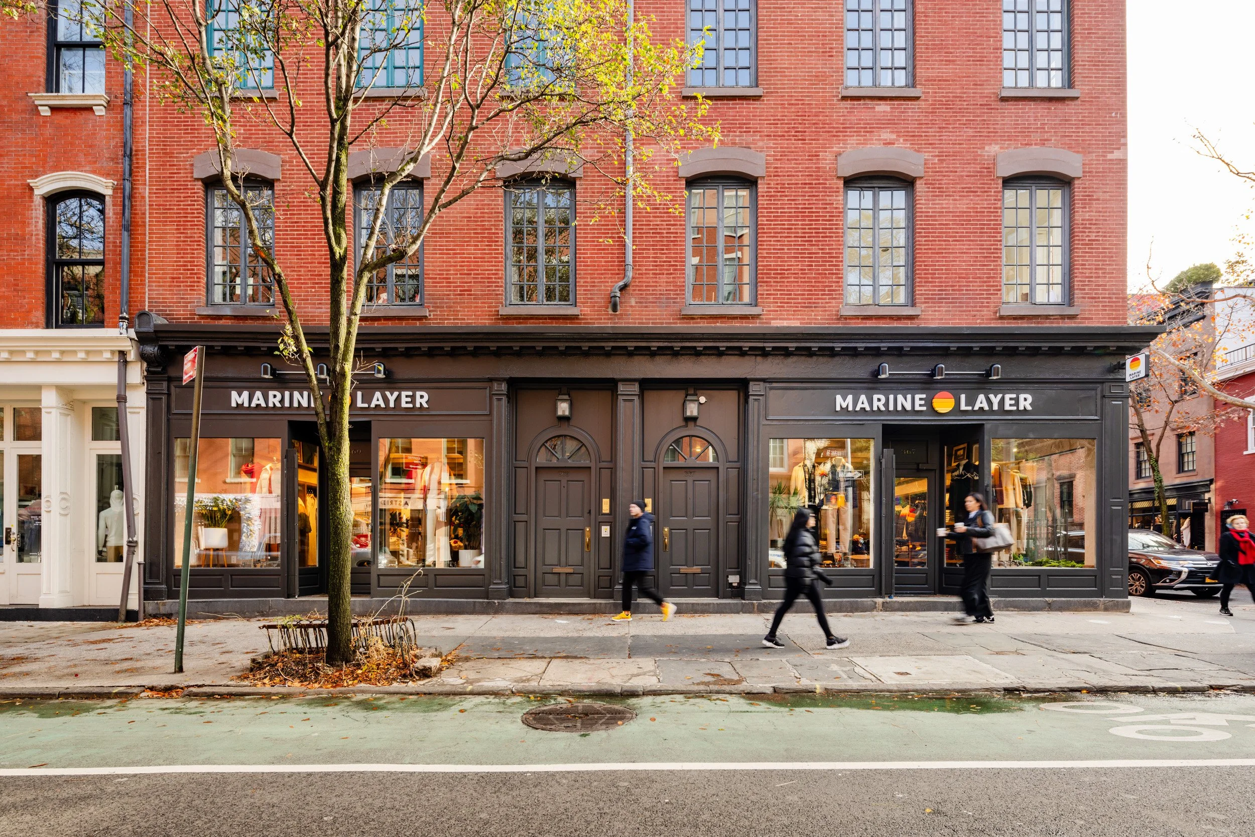
New York, Bleecker street
Philadelphia
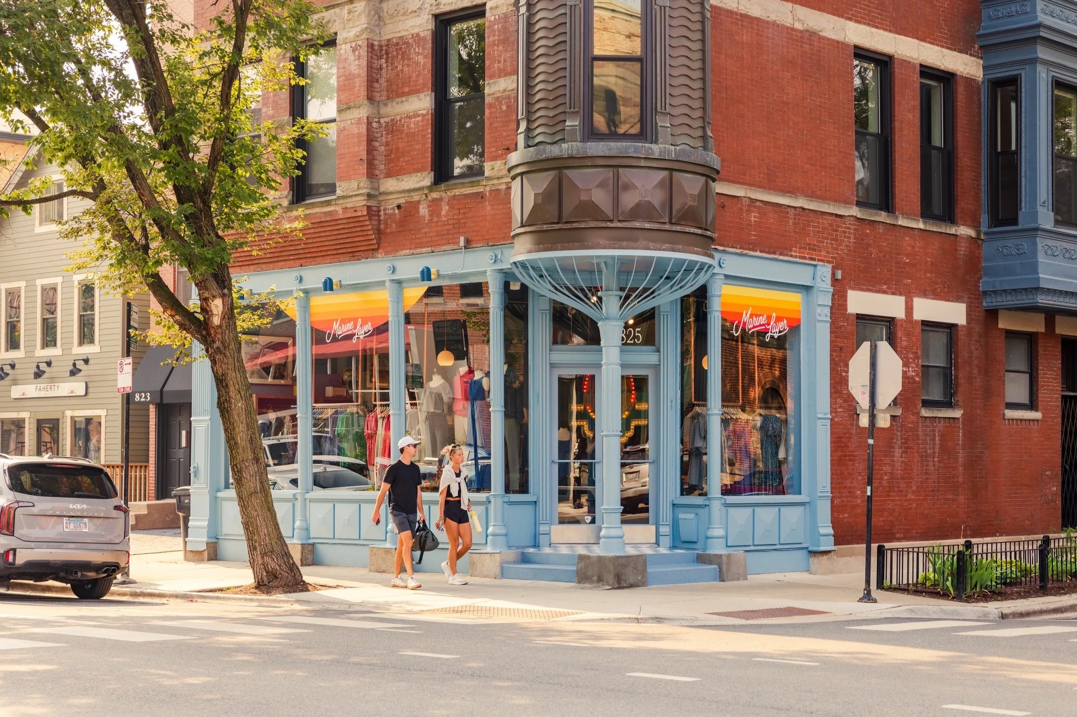
Chicago, Lincoln Park
Chicago, Lincoln Park
San Francisco, Hayes Valley
San Diego, Mission Valley
Minnesota, Mall of America
New Jersey
San Diego, La Jolla
New York, Brookfield Place
San Francisco, the Marina
New York, Nolita
Roseville, California
Los Angeles, Abbott Kinney
San Jose
San Francisco, Pacific Heights
Abbott Kinney, Los Angeles
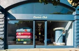
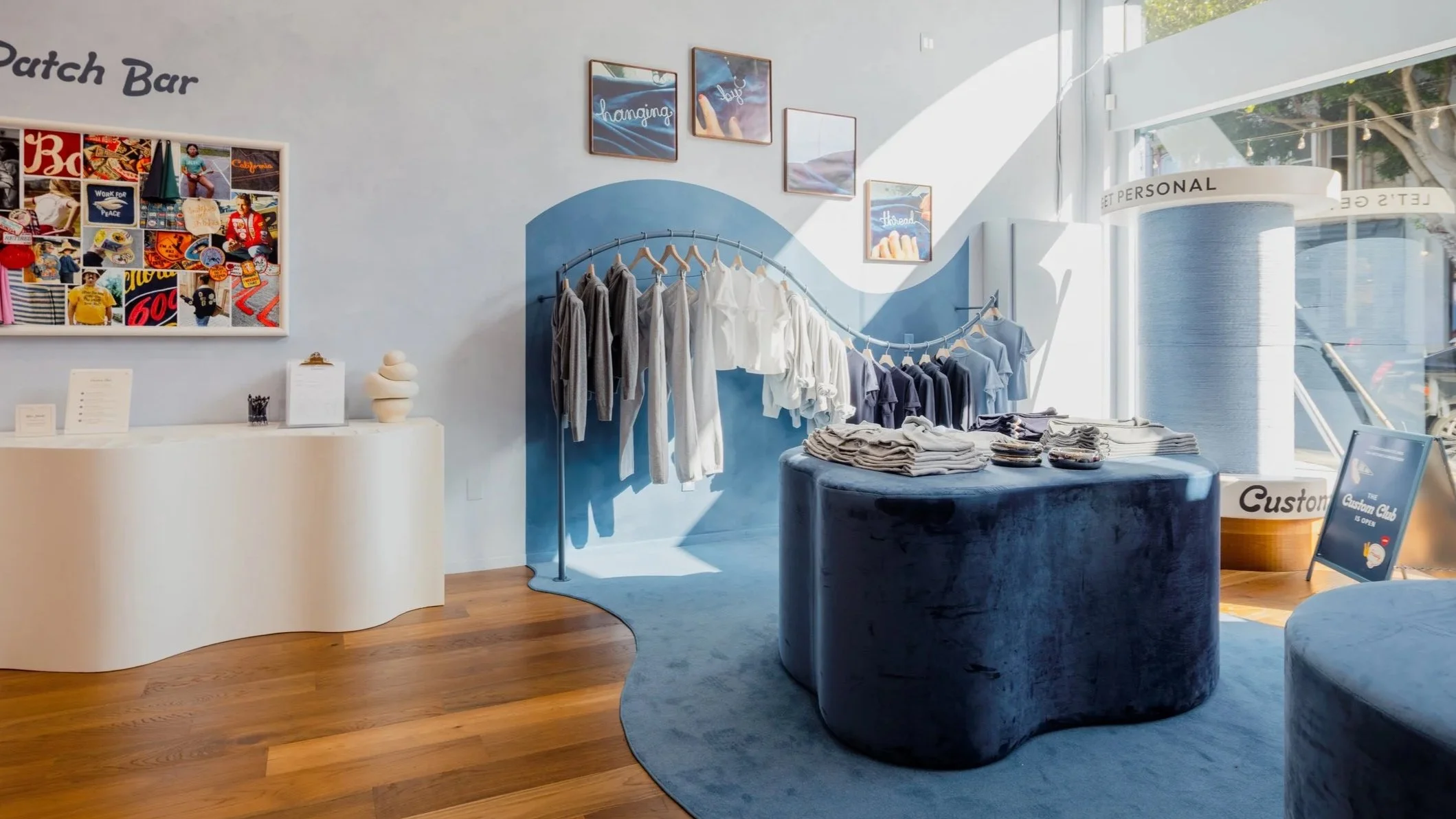
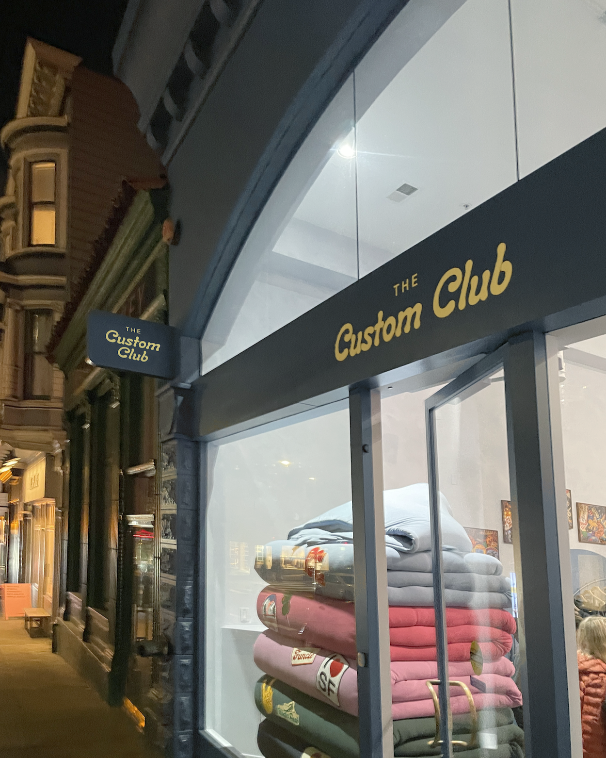
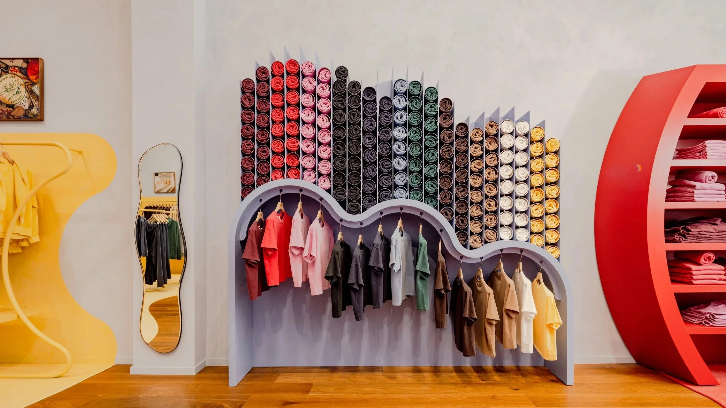
Case Study:
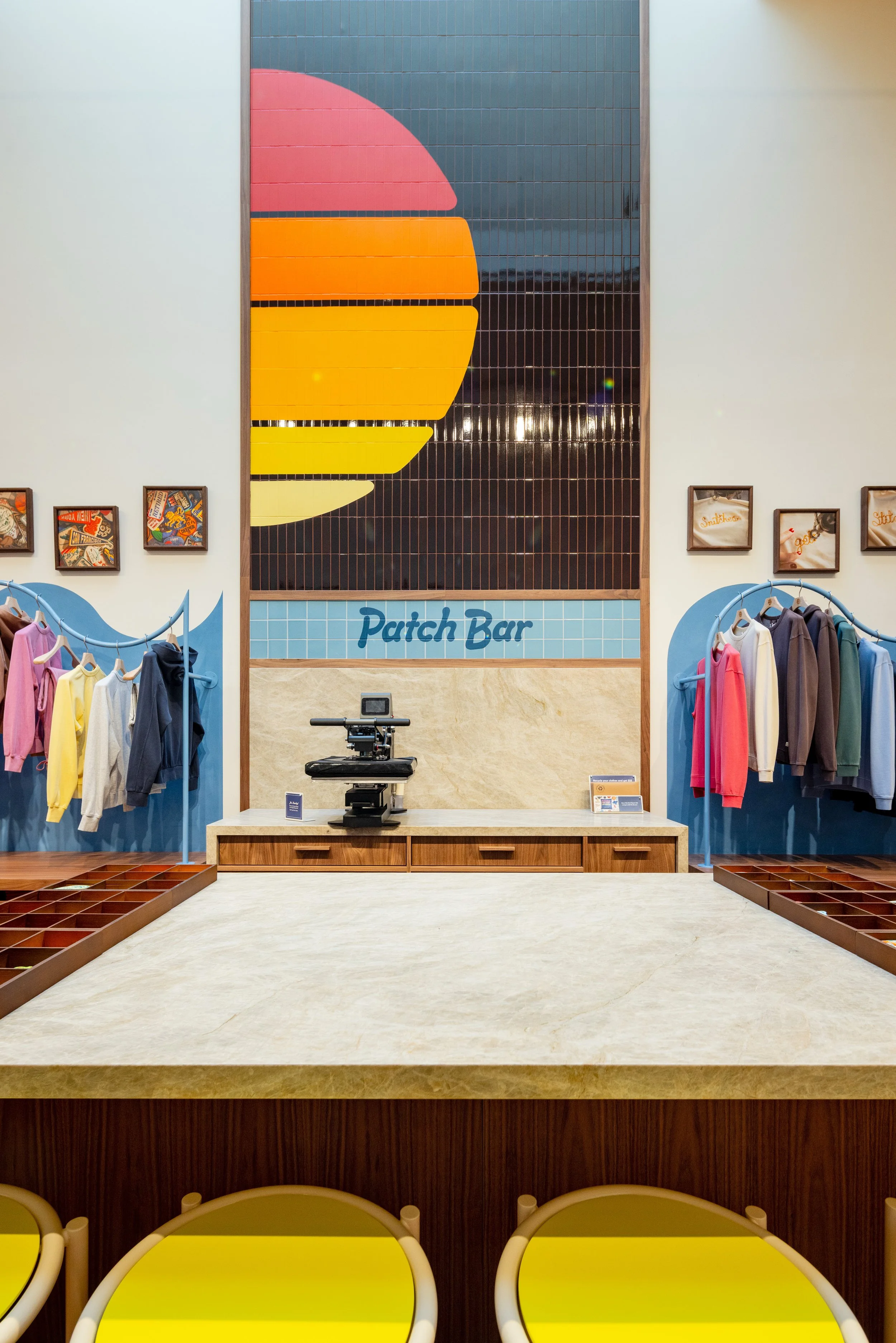
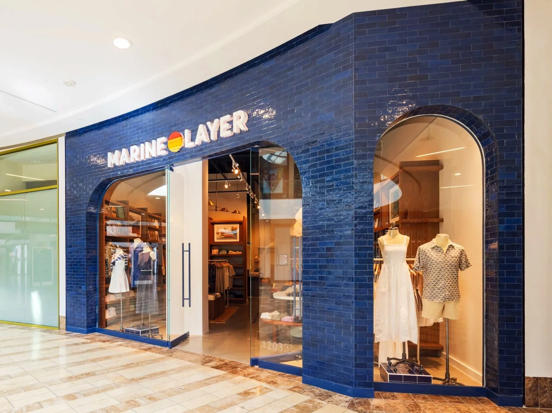
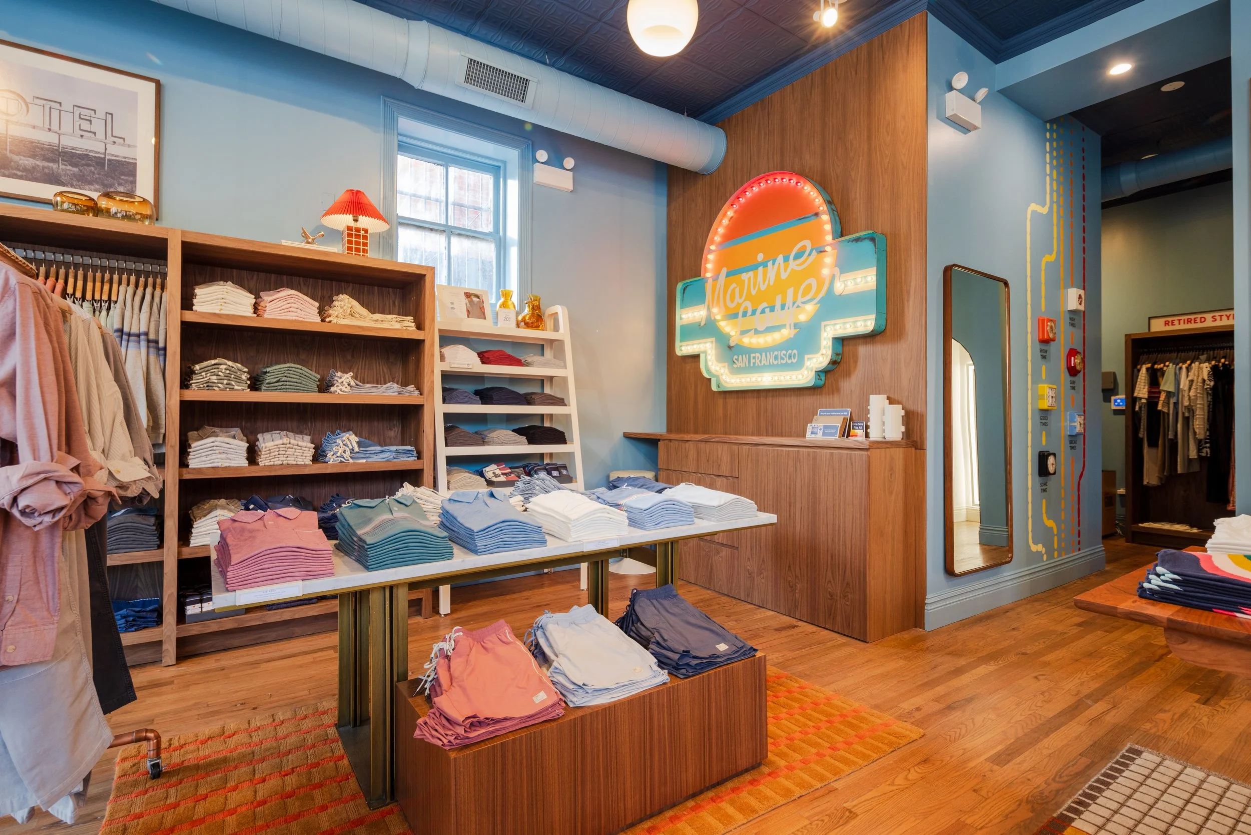
San Francisco’s Custom Club
Marine Layer had a crazy idea: build two stores, one on each US Coast, both banking big on delivering a ‘custom shop’. The challenge: upgrade the experience to insta-worthy spaces that inspired the nation-wide team of creators. Team solution: two, totally individual spaces.
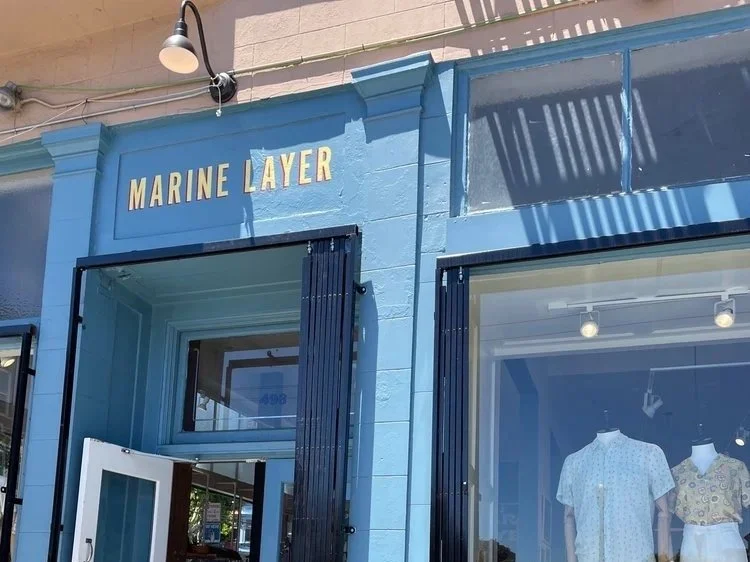
The San Francisco retail pad was bubbly and blue. Signage needed to be clean and characteristic, with clear references.
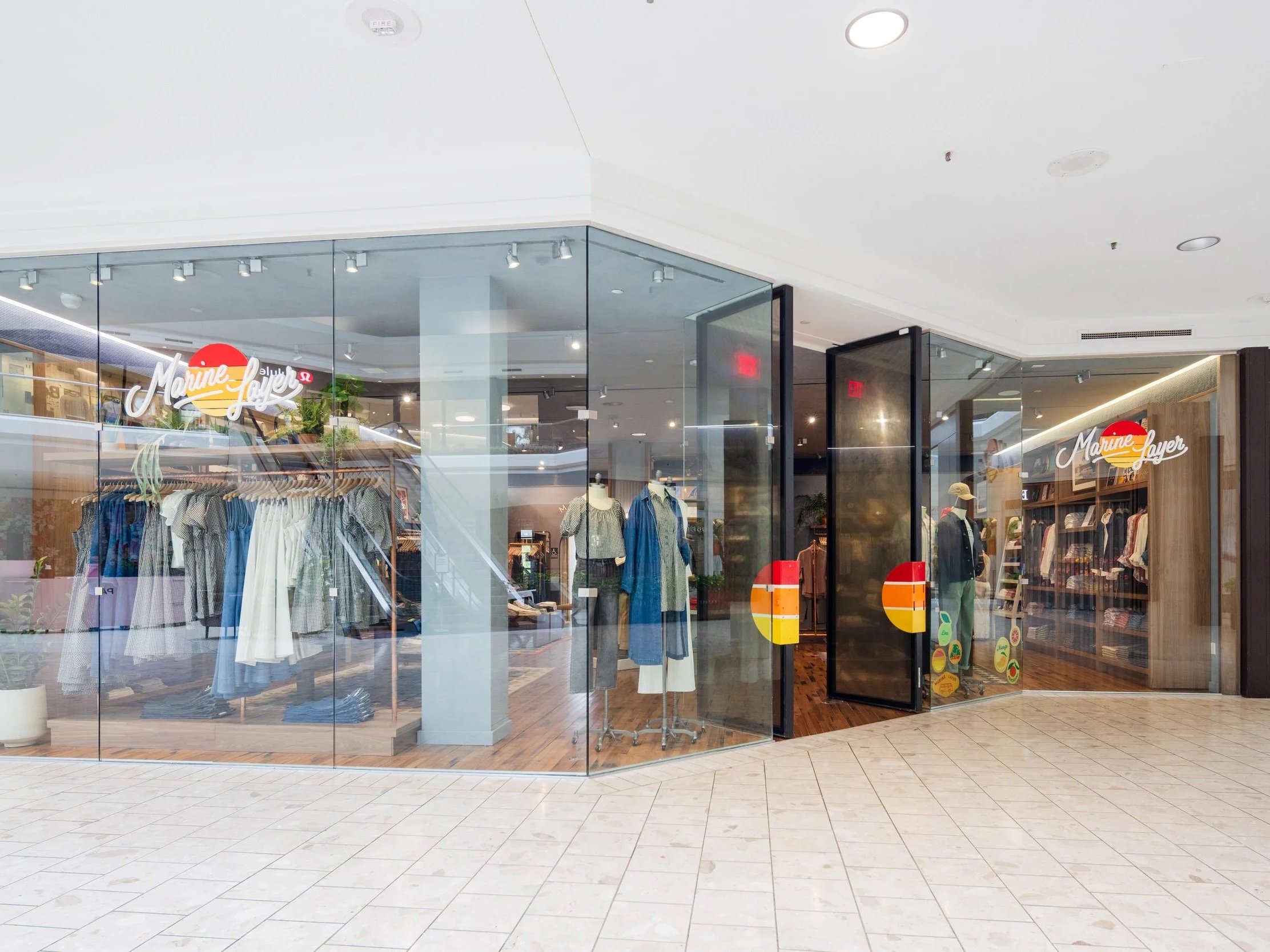
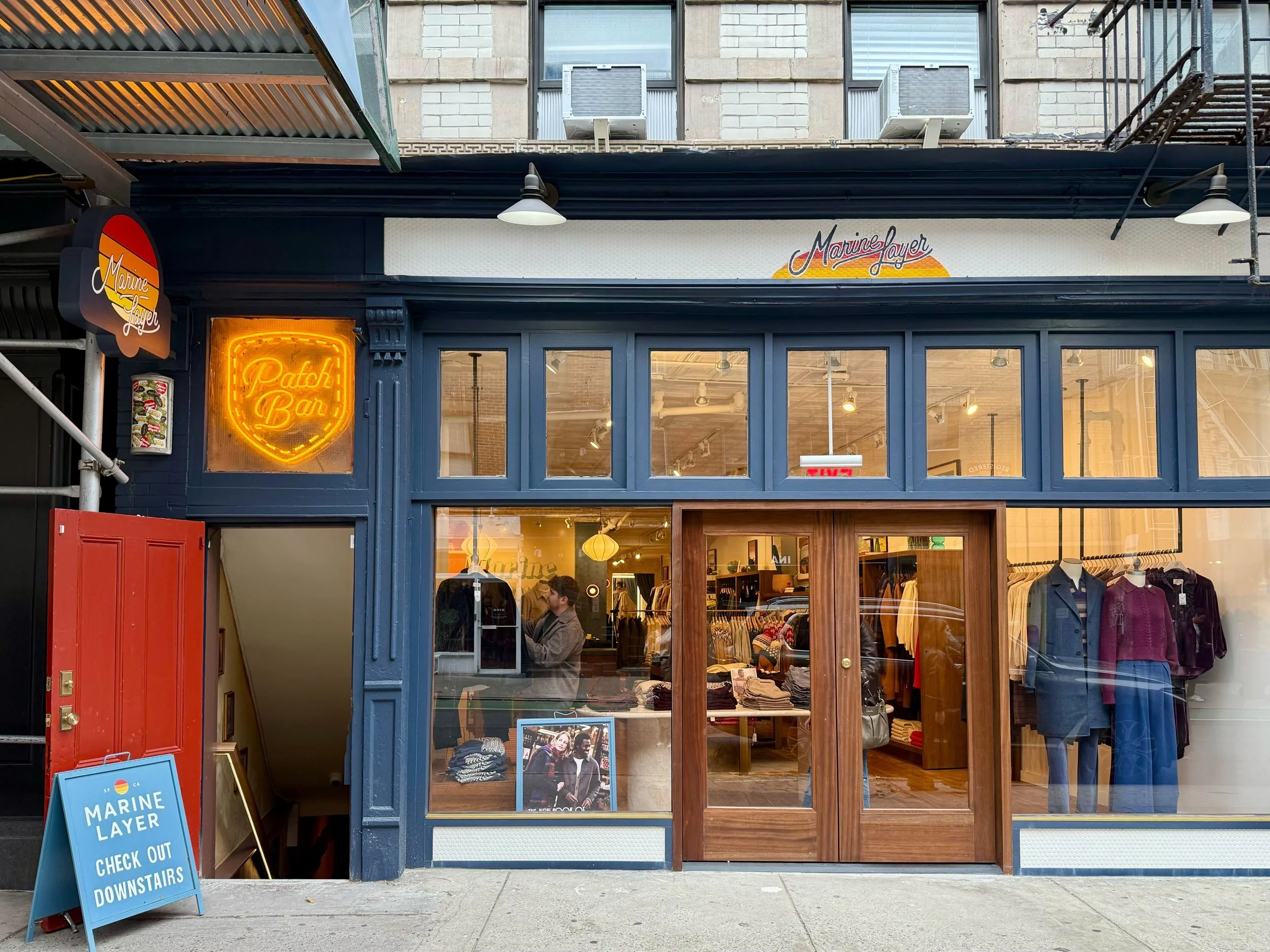
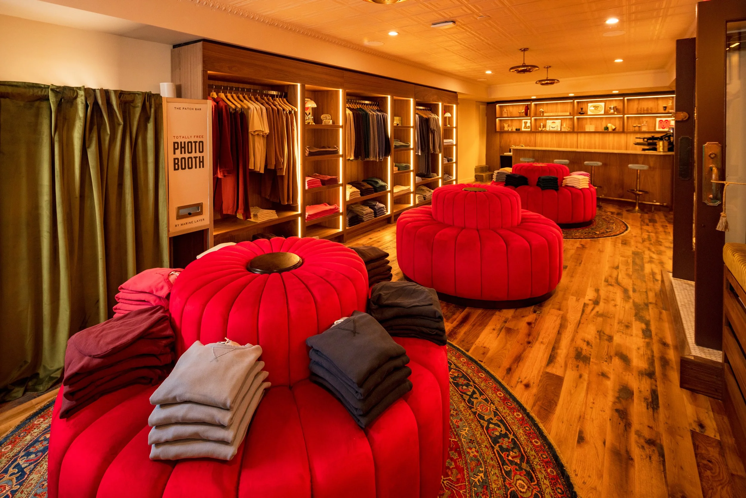
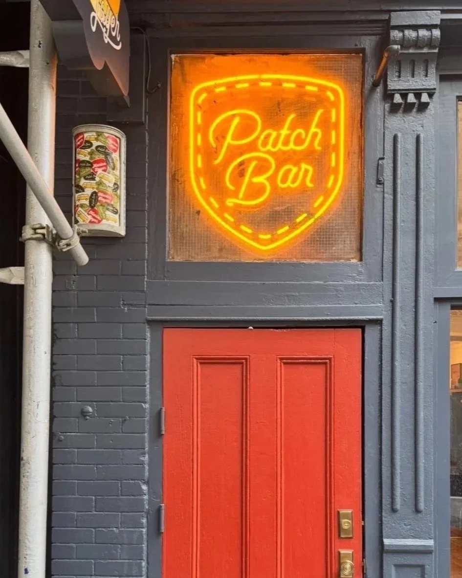
New York’s Patch Bar
Manhattan’s Nolita retail store was grungy, simmering, and speakeasy-esque. Like a whispered passcode, signage was less-is-more. Custom neon called Marine Layer and up all night. Installation was critical to the speakeasy vibe. Luckily, I had an aged, cracked, dingy double-pane window to create magical faux history for the basement shop.
While the Patch Bar launched, the permanent location upstairs was also being redesigned. Fresh signage, fixtures, and props were installed in phases and the store re-launched shortly after.
San Francisco, Marin
Case Study:
Bringing 1970’s SF to Chicago
In Chicago’s legendary Lincoln Park, the team was fortunate to work with a designated landmark building. Six rounds of concept sketches (!) and rigorous vetting later, we got approval on the signature, blue exterior. Exterior signage was installed in careful restoration-oriented phases.
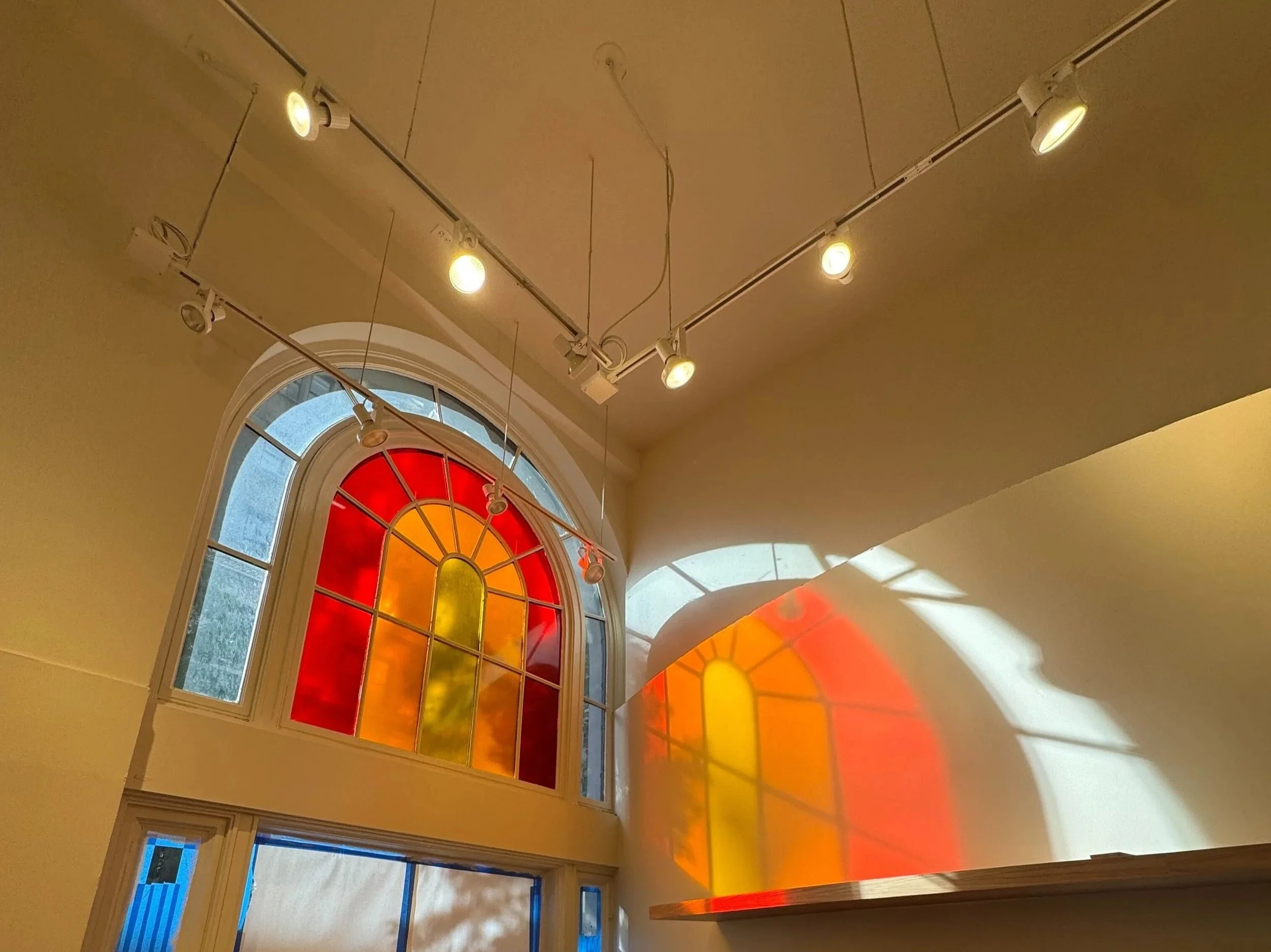
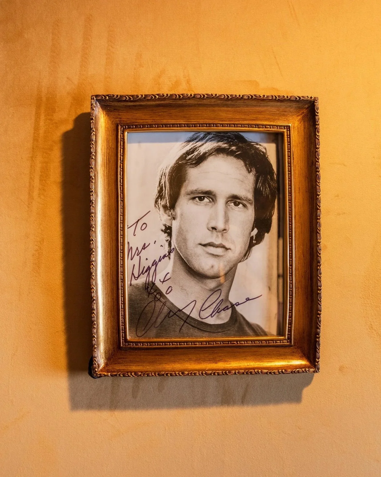
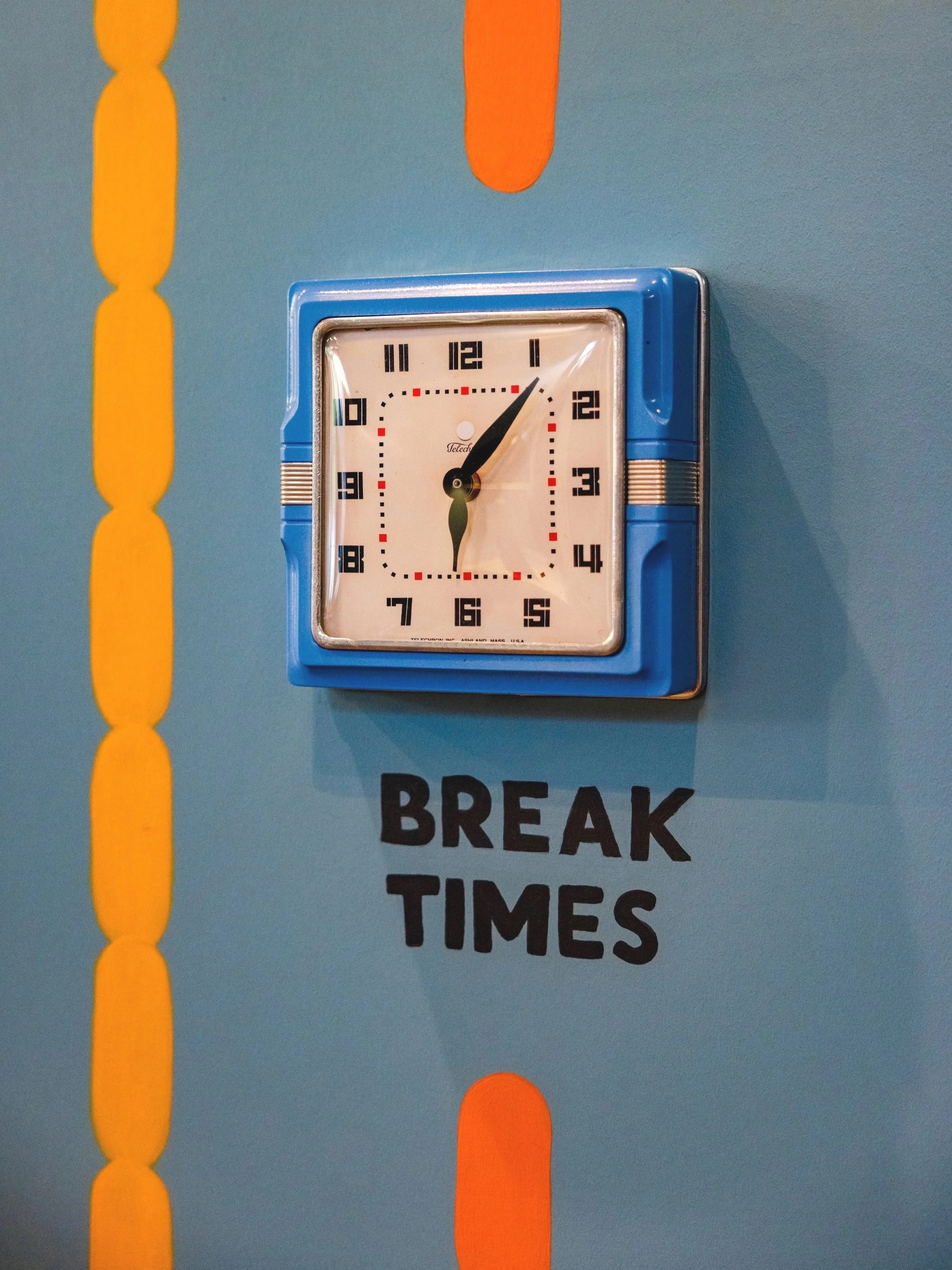
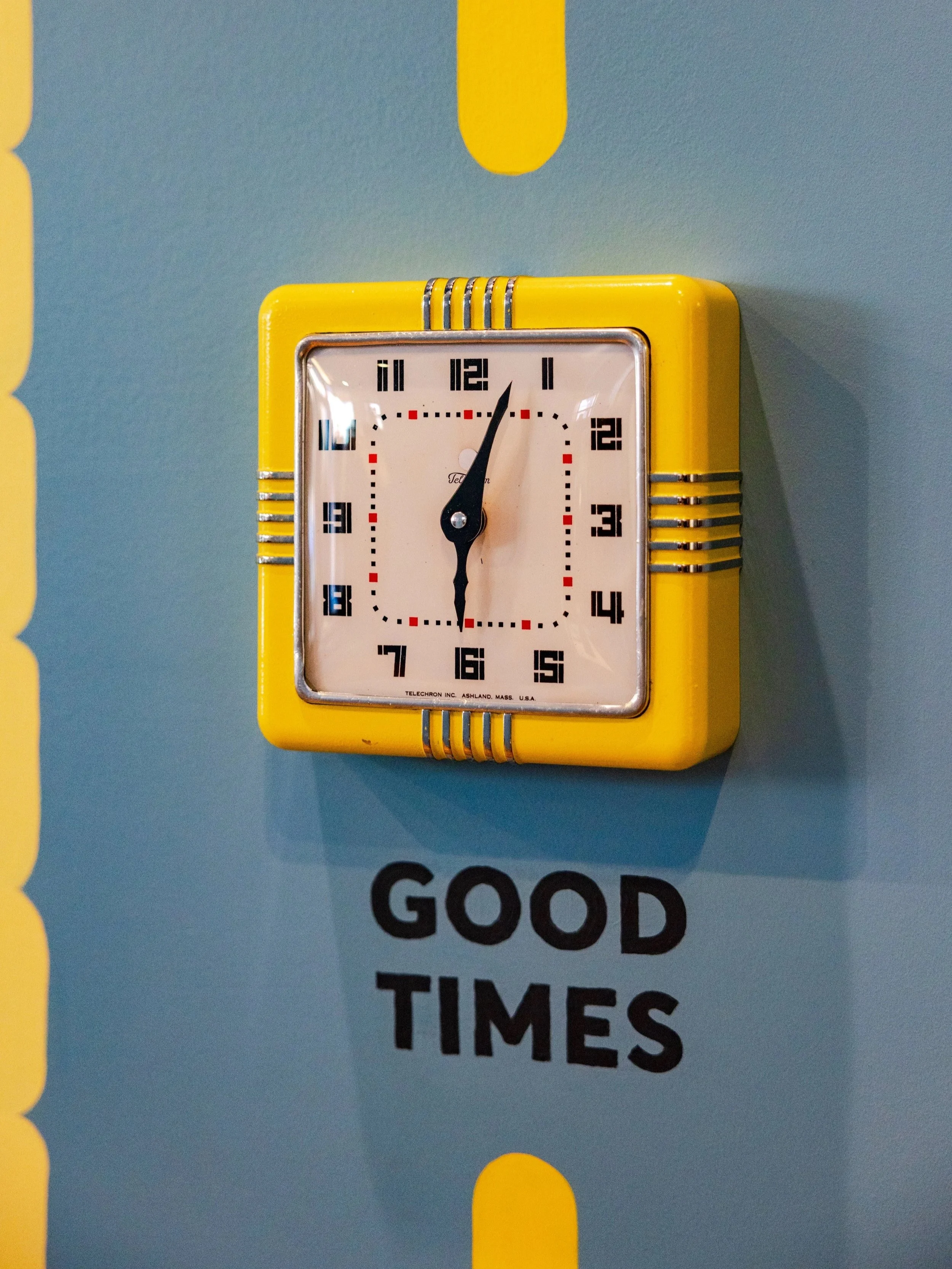
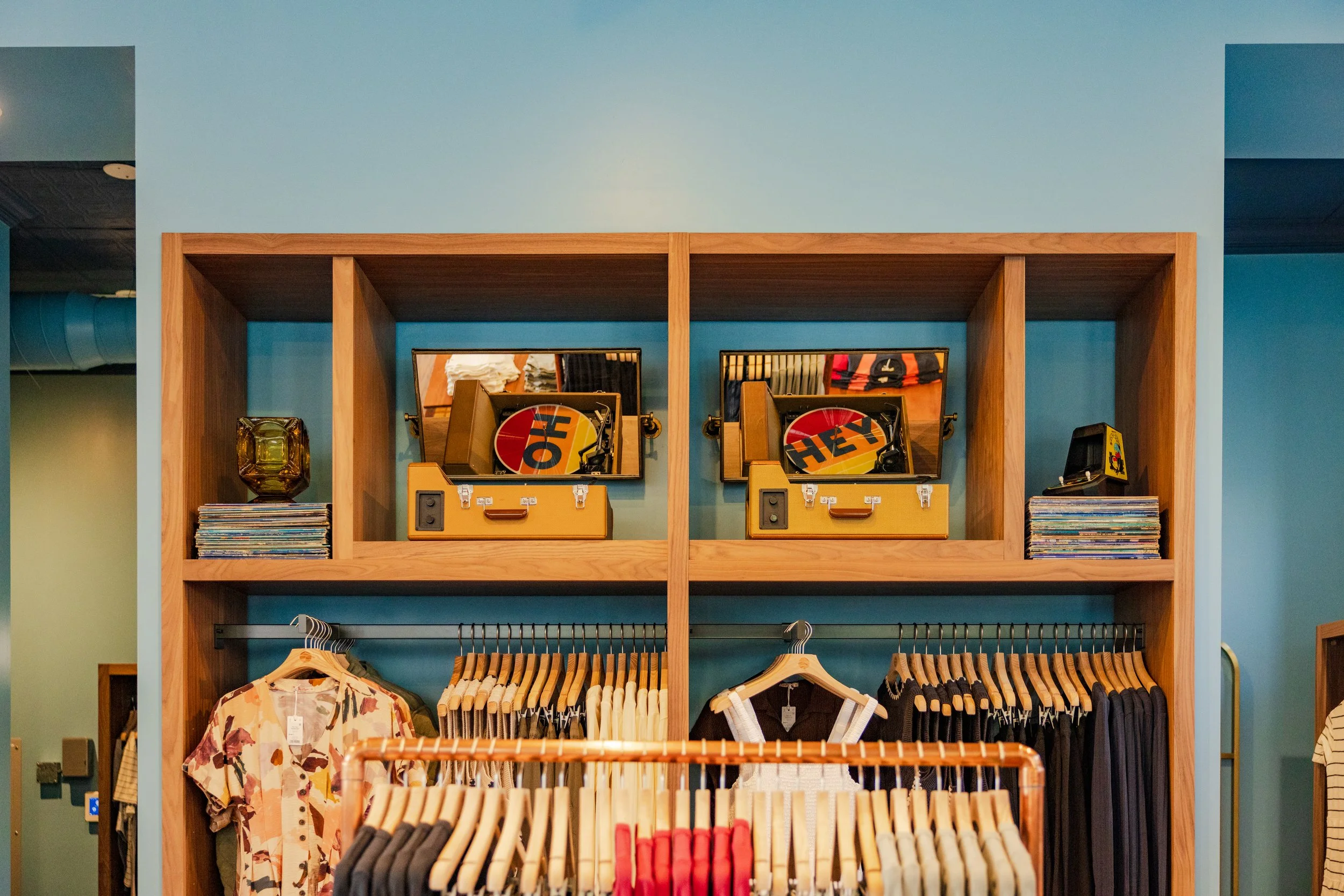
Inside, a vintage neon sign (instrumental to the original Brand design) served as my inspiration. The feature Brand wall is a playful take on time with a collection of vintage french clocks and hand-painted categories.
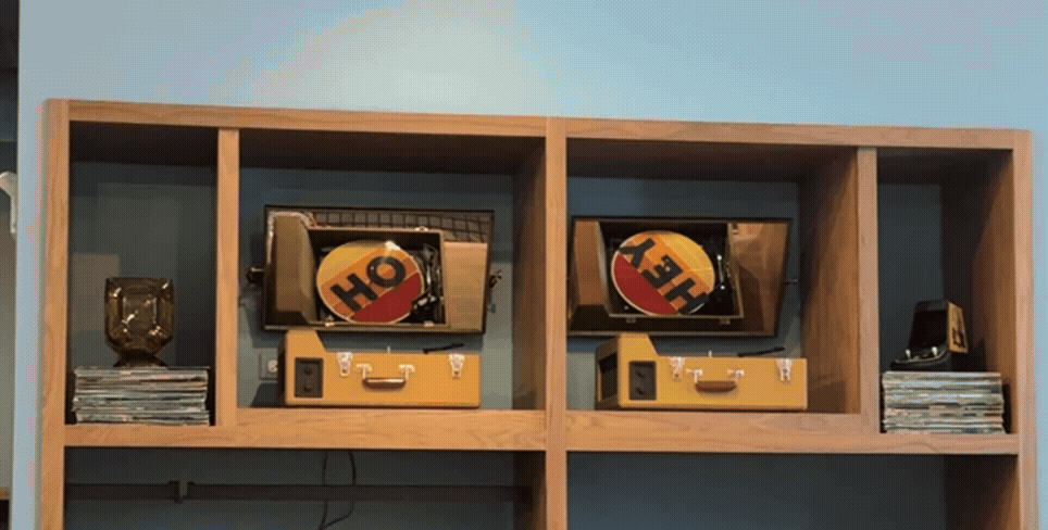
Above the center console wall, a set of custom records spin “Oh Hey”. I designed three unique sets; the store team can swap them out for fun.


As Marine Layer’s success skyrocketed, the Brand’s needed a lift.
In physical retail locations, inspiration came from 1970’s album artwork, graffiti, and murals. Hand-painted imperfection felt perfect, winking at the customer from corners (or spinning records). Boldly colored exteriors redefined stores across America, housing elevated, dynamite Branding inside.
Images © Marine Layer, 2024—2026
Client: Marine Layer
Location: San Francisco, CA, USA
Season: Winter 2024—Spring 2026
Role: Creative concepts, design and production
Format: Concept & design visualizations, exterior & interior signage, design & production systems tools
Disciplines: trends & market research, digital design, physical mockups